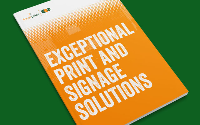
How can you be sure your customer communications are making the best impact possible? Here’s our designer Mike with his thoughts on what you can do from a design perspective…

Back when I was at art school, after each project was complete we would sit down and conduct a design critique. This would consist of a student presenting their work to the group – explaining the decision-making process that resulted in their final design.
The other students in the group would then give their feedback and, finally, our teachers would share their thoughts too.
This is an essential process for any student because it not only teaches you the skills to present your work to prospecting clients, it also teaches you how to take criticism – a vital skill for anybody working in a creative industry.
During one of my early design critiques my teacher gave me some confusing feedback.
After presenting my work and getting relatively positive comments from the class he looked at me with a smirk on his face and said…
“It’s a load of CRAP. I love it.”
At first I thought he was being sarcastic but it turned out that he really did like the work – he just had a slightly different definition of crap to me.
For him crap was an acronym for something else:
Contrast
Repetition
Alignment
Proximity
Four fundamental principles of any good design.
Contrast
As with all aspects of life, a way of standing out from the crowd is to have a point of difference.
Contrast is used to focus attention. We use contrast to create a hierarchy of information and to highlight key points that we want the audience to take away.
Contrast can be applied to use of colour, scale, fonts, images and more.
Think of a newspaper cover. It will contain lots of information and images relating to different content but you always know what the main story is due to the contrasting size, weight and proportion of the page it occupies.
Repetition
In this instance, repetition does not refer to content. A web page containing the same paragraph of text 3 times is not an example of good design.
However, a repetition of fonts, colour, shape, texture, spatial relationships, line thicknesses and sizes can help unify a design.
Another word to describe this would be “consistency” – but this doesn’t create an amusing acronym…
Alignment
Alignment allows us to organise information while making it easier for the audience to absorb.
Try reading a large quantity of centered text. Your eyes will find it much more difficult to find the next line when compared to reading left aligned text. Ever seen a novel with centred text?
Designers use a system of grids, margins, columns and modules to organise content and give designs a consistent orderly look.
Good alignment often goes unnoticed but bad alignment will stick out like a sore thumb.
Think of the one car in the car park which is outside the lines. Not only does it stand out but you also think negatively of the driver.
Proximity
A single design could contain any number of elements with different relationships to each other. Proximity helps to signify these relationships.
We know, for example, that the caption closest to an image is related to that specific image.
We know which product we are buying when we click the “add to basket” button because of its proximity to the text and images relating to that product.
When several items are in close proximity to each other, they became one coherent visual. When they are too far apart they become disjointed.
So, how can you use these design principles?
These four principles can help you create focused marketing communications that drive attention to most important messages and will help ensure that your content resonates with the people that matter the most.
Take a look at your company’s website, review your sales materials and even look at your company’s branding – ask yourself, does it have Contrast, Repetition, Alignment and Proximity?
Is it C.R.A.P. or would you value some advice on improving visual impact and clarity of messaging?